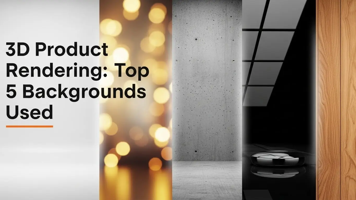
3D Product Rendering: Background plays a key role in uplifting the image. Many types of backgrounds can be used in 3D product model images. These backgrounds are used in promotional marketing, both online and traditionally. Nowadays, online platforms such as social media and e-commerce sites are popular for businesses. To capture the customer’s attention, the background is crucial. It impacts their purchasing decisions. As you can see, different companies use different types of backgrounds to get higher traffic and sales. Here we are going to discuss the Top 5 Different Types of Backgrounds for product rendering.
What Is 3D Product Rendering?
3D Product Rendering is the process of creating two two-dimensional images from a 3D model by using specific software in a computer. The benefit of 3D rendering is that it makes it eye-catching to customers how it looks and its functionalities. The background sets the stage for the rendered object, giving it a sense of place, depth, and realism. A well-designed background complements the main subject, enhancing its visual impact and storytelling.
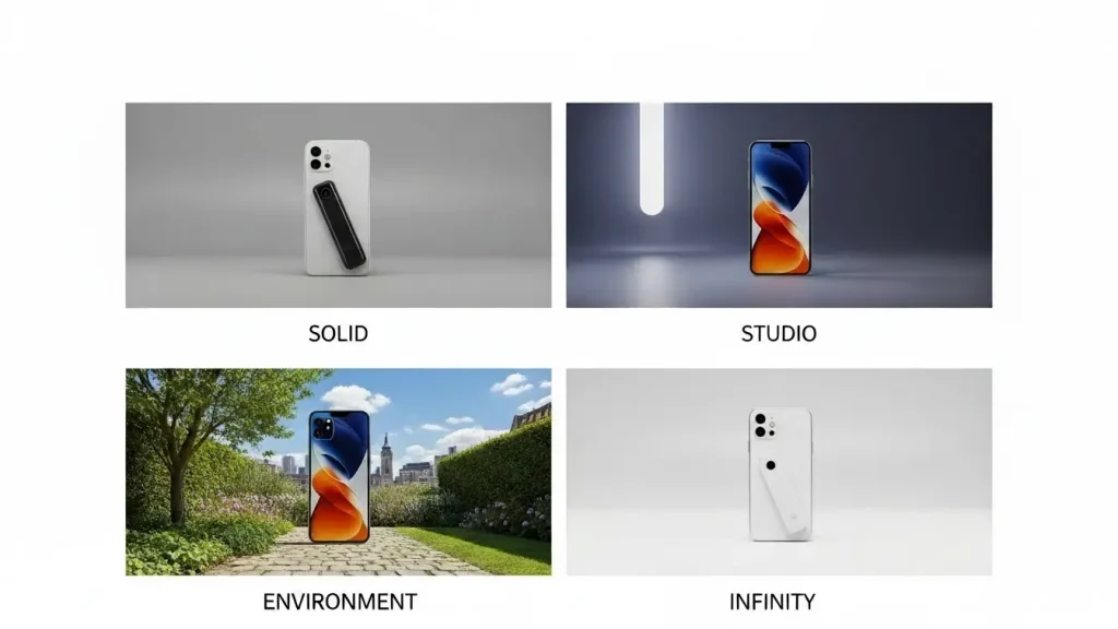
What Are the Different Types of Backgrounds Used in Product 3D Rendering?
3D Product Rendering: There are many types of backgrounds, but we will discuss the Top 5 Different Types of Backgrounds here.
White background
White is one of the most popular background choices for 3D-rendered product images, particularly for marketing and e-commerce. It effectively highlights the product’s features in detail while reducing any distractions or confusion for customers.
Variations of white, such as off-white and light gray, are also commonly used to create subtle distinctions. The 3D artist’s skill in designing the product model is crucial to making the image stand out against a white background. Proper use of lighting and reflections ensures the product appears both appealing and prominent, capturing attention and enhancing its visual appeal.
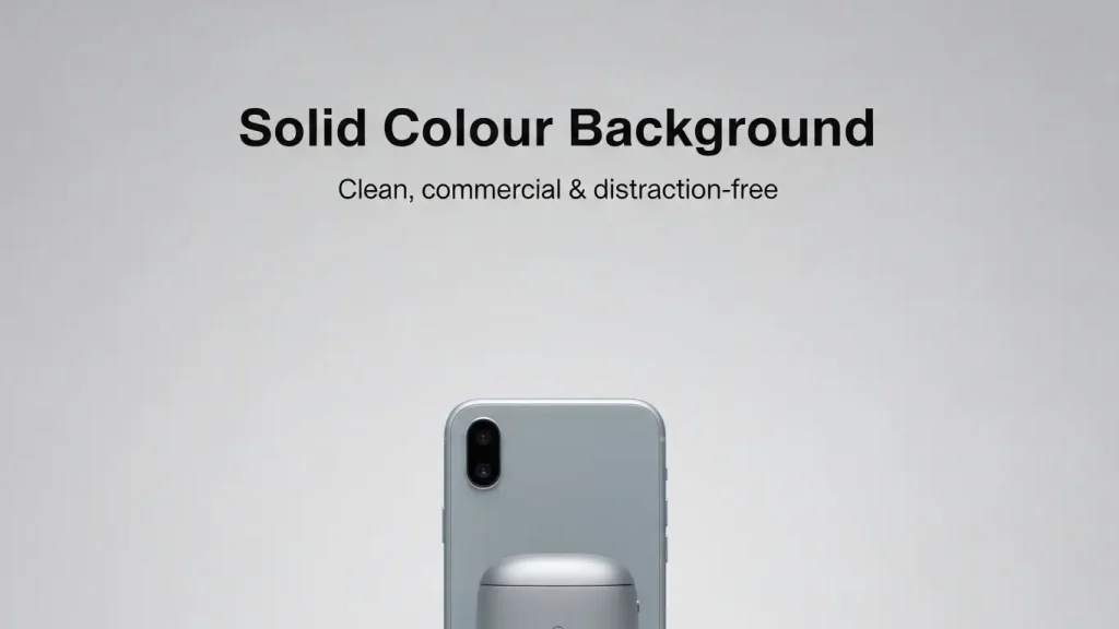
Solid Colour Background
Black, light blue, yellow, and pastel pink are popular for experimenting with product displays against solid backgrounds. While red and green are occasionally used, their application is limited and depends heavily on the product’s colour. Red and green are generally avoided for darker-colored products to maintain visual harmony.
In addition to using single colours, sellers often pair two solid colours for the background, such as pastel blue and pastel pink, as pastel shades are currently in trend. These colours are not blended but are separated by a distinct, well-defined line, typically running through the middle, creating a clean, modern aesthetic.
Gradient Background
A gradient background refers to the transition from dark to light colours. These two couples were paired to enhance the visual effect. Without study, if you use multiple colours, then it could be a disaster. For tech and jewelry-related product websites, a gradient colour is the best for use. This type of colour pairing work should be done under expert supervision.
Lifestyle Backgrounds
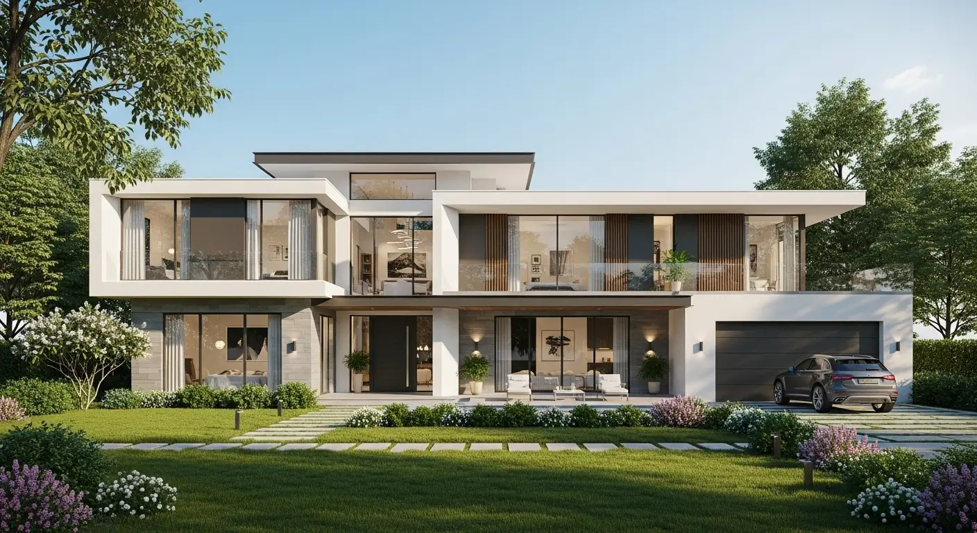
In the e-commerce sector for furniture and interior design, lifestyle backgrounds are a big trend. Since millennials, who make up the majority of customers, prefer to see things in realistic settings such as living rooms, bedrooms, kitchens, balconies, or bathrooms, they have become a crucial feature of product marketing, especially for furniture. These backgrounds give consumers a better idea of the room’s size, texture, and quality, as well as a visual depiction of how a product will look in a given environment.
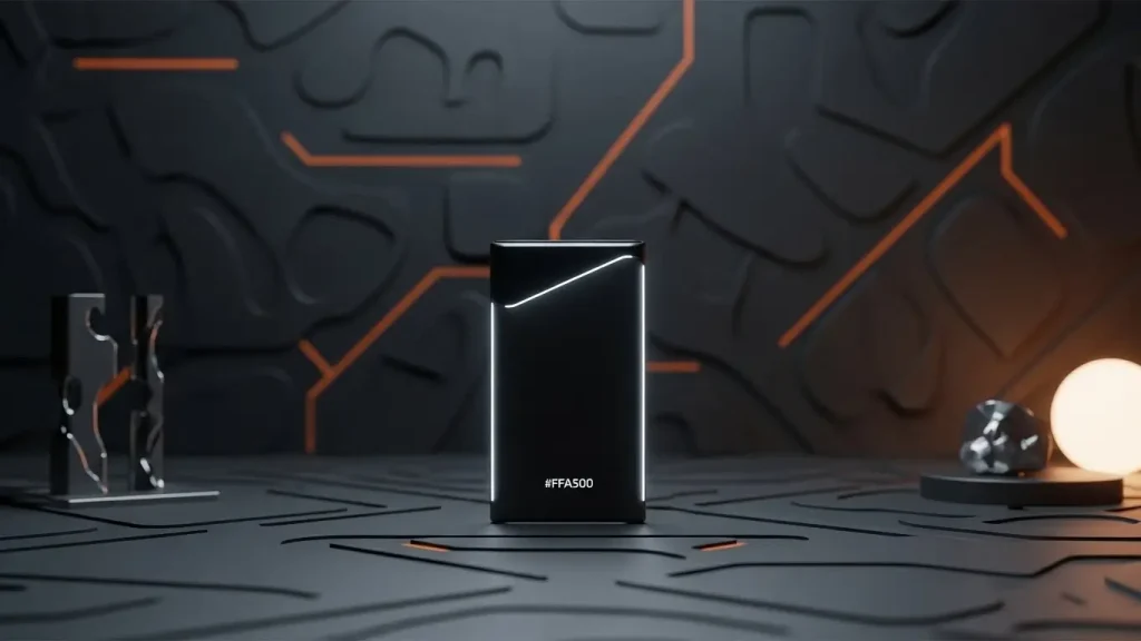
Custom Background
When you use a background colour for your specific product image, it is called a custom background. The terms “custom background” and “contextual background” refer to a special kind of background used with product representations and tailored to the situation. Customers are given more ideas for adorning their homes when things are marketed using storytelling.
To match the product on display, sellers adjust the background by adding and removing objects. Customers frequently purchase the extra props shown beside the main product, even when the merchant isn’t trying to market them.
Why use different backgrounds in product 3D renders?
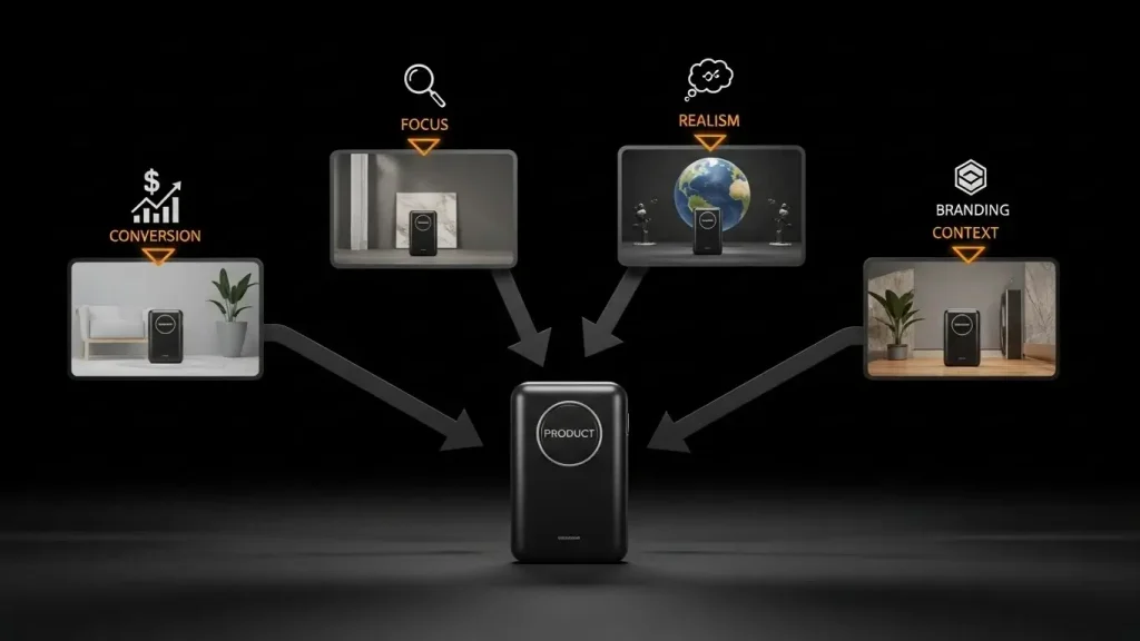
Emphasize the Features of the Product
Details are made easier to see against a white or neutral background, which keeps the attention on the product. On the other hand, contrasting backdrops can better highlight colours, textures, and materials, enhancing the product’s visibility.
Establish a Realistic Setting
Potential customers can better envision the product’s use when it is displayed in a contextual location, such as a car on the road or furniture in a living room. Realistic backdrops improve the brand narrative and forge closer ties with consumers.
Boost Visual Appeal
Various background styles, such as dramatic, colourful, textured, or minimalist, might evoke particular feelings or complement the brand’s aesthetics. Particularly for social media and ads, renders with distinctive or artistic backdrops are more visually appealing.
Serve a Variety of Platforms and Audiences
Product listings on e-commerce sites like Amazon and eBay must have transparent, white backgrounds. However, more imaginative or themed backgrounds are better for ads, websites, and social media. A/B testing is also made possible by using various backdrops to determine which images receive the most interaction.
Improve Your Branding
Brand awareness is aided with custom backgrounds that include brand colours, emblems, or themes. Customers receive a unified visual experience, and brand identity is reinforced when background styles are consistent across items.
Adjust to Trends and Seasons
Marketing initiatives are more relevant when they use seasonal or trend-based backgrounds, like summer vibes or Christmas motifs. Additionally, backgrounds can be changed to reflect contemporary design styles without changing the actual product model.
Conclusion
Choosing the right 3D product rendering background is essential for enhancing the visual appeal and effectiveness of the final image. Whether you opt for a white background to maintain a clean, professional look, a transparent background for easy adaptability across platforms, a studio background for a high-end commercial feel, or a realistic background to create an immersive product experience, each type serves a distinct purpose. Understanding these background choices ensures that your product not only captures attention but also aligns with branding and marketing goals.
FAQs
What are the different types of backgrounds?
Different types of backgrounds include solid color, transparent, natural/environmental, gradient, textured, and custom digital backgrounds, each used depending on the purpose of the image or design.
What are some popular background styles?
Some popular background styles are minimalist, abstract, nature-inspired, studio/white, bokeh, gradient, and lifestyle/environmental, which are chosen to enhance the content and according to the purpose of the project.
How do I choose a unique background?
To choose a unique background, consider your subject, brand style, target audience, and the mood you want to convey, and make sure it complements rather than distracts from the main focus.
What are the 4 types of images?
The four main types of images are raster (bitmap), vector, 3D and GIF/animated images, each serving different purposes in design, web and multimedia projects.
What is the most common background color?
The most common background color is white, as it provides a clean, neutral and versatile background that highlights the content and works well for most design and product images.
What are the different types of backgrounds?
Different types of backgrounds include solid colors, gradients, textures, patterns, natural/environmental scenes, studio setups and digital/custom designs, which are chosen based on the purpose of the image and the desired effect.


